overview
Developed a cohesive, high-fidelity visual system for the 2026 Red Bull Tennessee National, a premier off-road event at Windrock Park. The project required a sophisticated design bridge between two distinct global identities: Red Bull’s high-energy athletic branding and Gibson Guitar’s heritage craftsmanship.
Approach
challenge
Brand Synergy: Engineered a design language that respected rigorous Red Bull brand guidelines while seamlessly incorporating Gibson’s instrument-focused aesthetic.
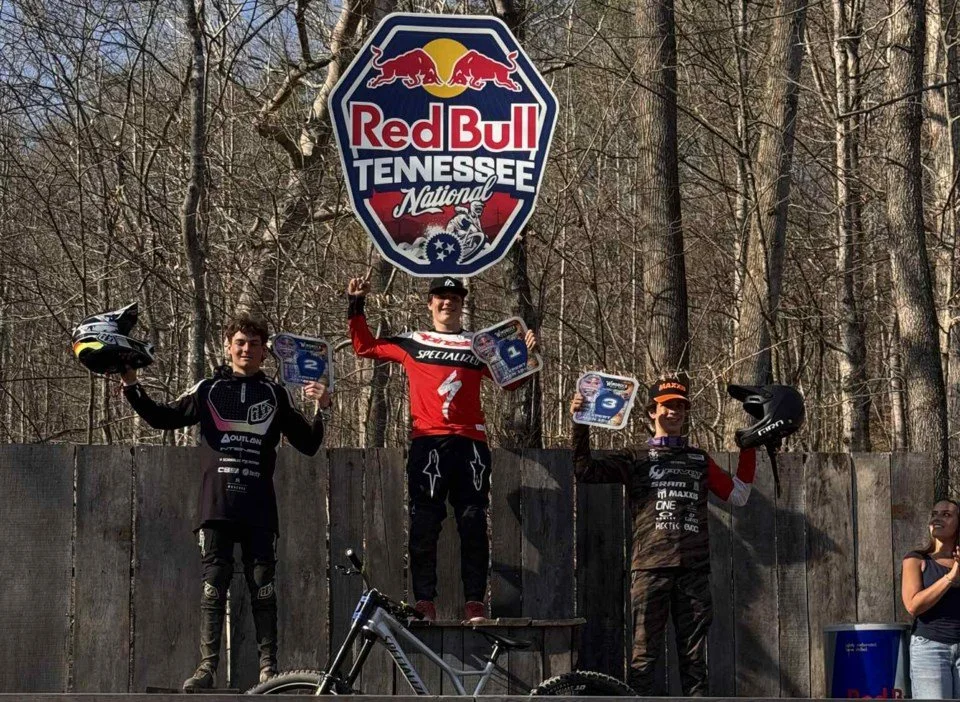
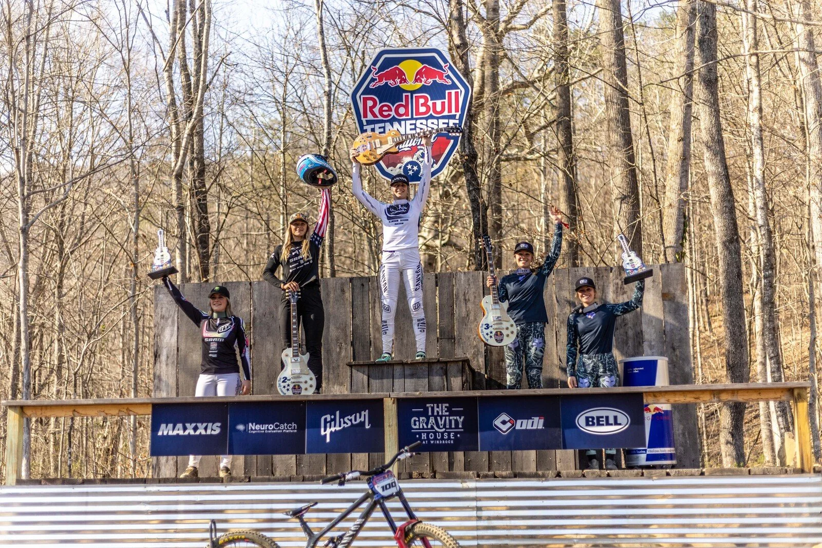
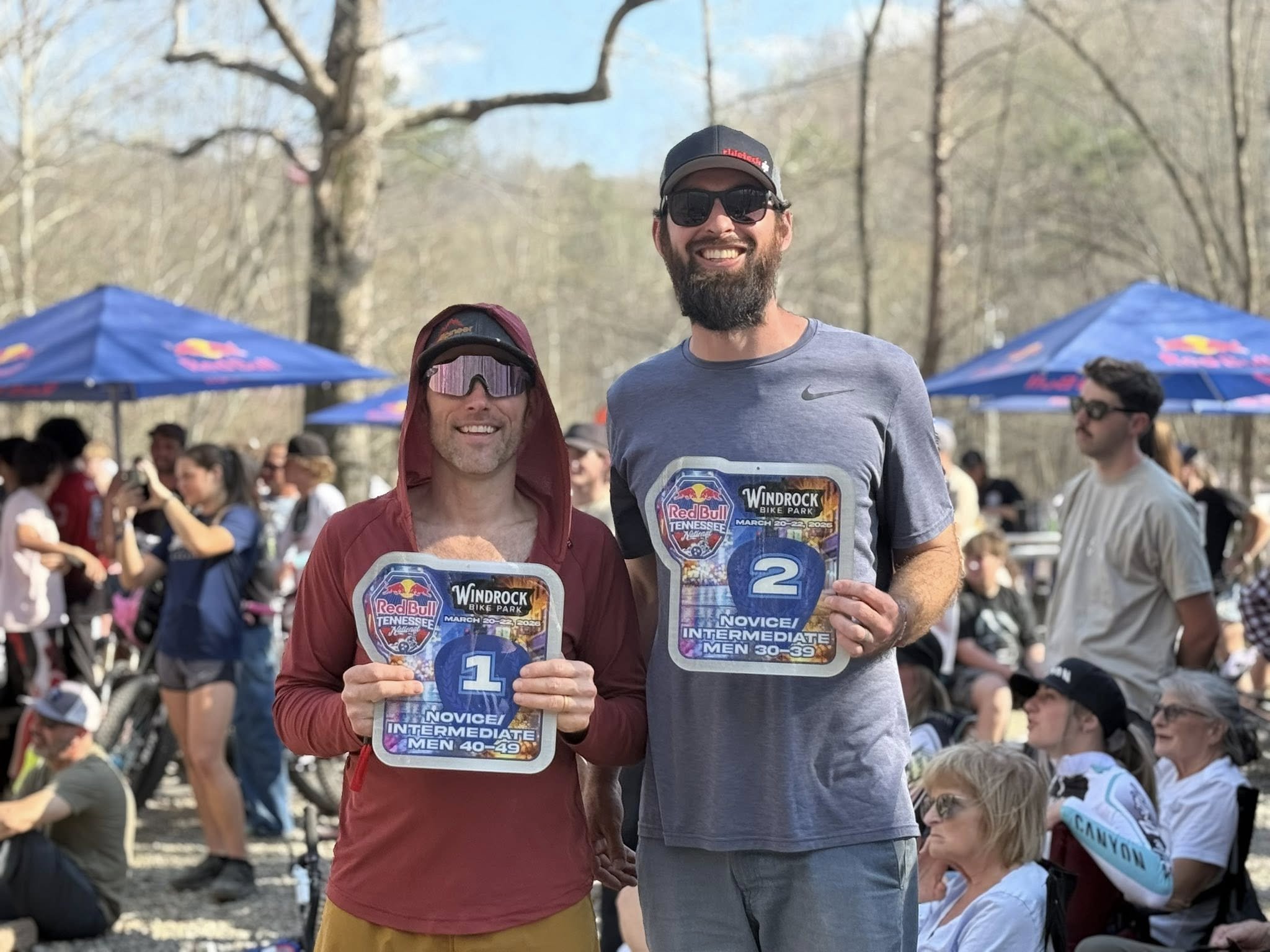
Tiered Hierarchy: Designed secondary award tiers that maintained the prestige of the 1st–3rd place Gibson prizes while establishing a unique, stand-alone visual identity for the 4th and 5th place recipients.
System Cohesion: Created a unified visual thread across multiple physical formats, ensuring that custom-built awards and branded plates functioned as a singular, professional set.
The Strategic Challenge
Brand Synergy: Engineered a design language that respected rigorous Red Bull brand guidelines while seamlessly incorporating Gibson’s instrument-focused aesthetic.
Tiered Hierarchy: Designed secondary award tiers that maintained the prestige of the 1st–3rd place Gibson prizes while establishing a unique, stand-alone visual identity for the 4th and 5th place recipients.
System Cohesion: Created a unified visual thread across multiple physical formats, ensuring that custom-built awards and branded plates functioned as a singular, professional set.
Design Execution & Creative Direction
Information Hierarchy: Positioned the guitar as the central visual anchor to honor the partnership, utilizing a symmetrical centerline layout to balance the Red Bull identity and placement typography.
Visual Storytelling: Integrated a custom graphic of the Knoxville, Tennessee skyline to provide geographical context and add a modern, "digital-first" texture to the physical assets.
Color & Typography: Executed a high-contrast palette using Red Bull’s signature blues and whites. Selected a modern Sans-Serif typeface to complement the brand's athletic aesthetic while maintaining distinct readability.
Material Design: Utilized steel textures and multidimensional framing to elevate the "built" feel of the assets, translating digital design concepts into high-impact physical objects.
Result
Delivered a comprehensive suite of branded assets that adhered to tight global standards while successfully differentiating the event’s various prize tiers. The final collection functioned as a cohesive brand ecosystem rather than individual prizes, strengthening the visual impact of the Red Bull x Gibson partnership