overview
This editorial project is a comprehensive typographic exploration of Palatino, the classic old-style serif designed by Hermann Zapf. The objective was to produce a commemorative booklet that balances historical narrative with technical typographic analysis, celebrating the typeface's post-war heritage and enduring legibility.
The goal was to showcase Palatino’s history, structure, and usage, while adhering to strict constraints:
Only use the Palatino typeface throughout the booklet
Include two images per page (except the cover)
Document the full alphabet (uppercase and lowercase) and numbers 0–9
Respect a 20,000-word per page limit
Use a limited duotone color palette
These parameters pushed me to think creatively about layout, typographic hierarchy, and how to balance text and imagery effectively while also making it look visually interesting since I had a muted color palette to work with.
Challenge
Approach
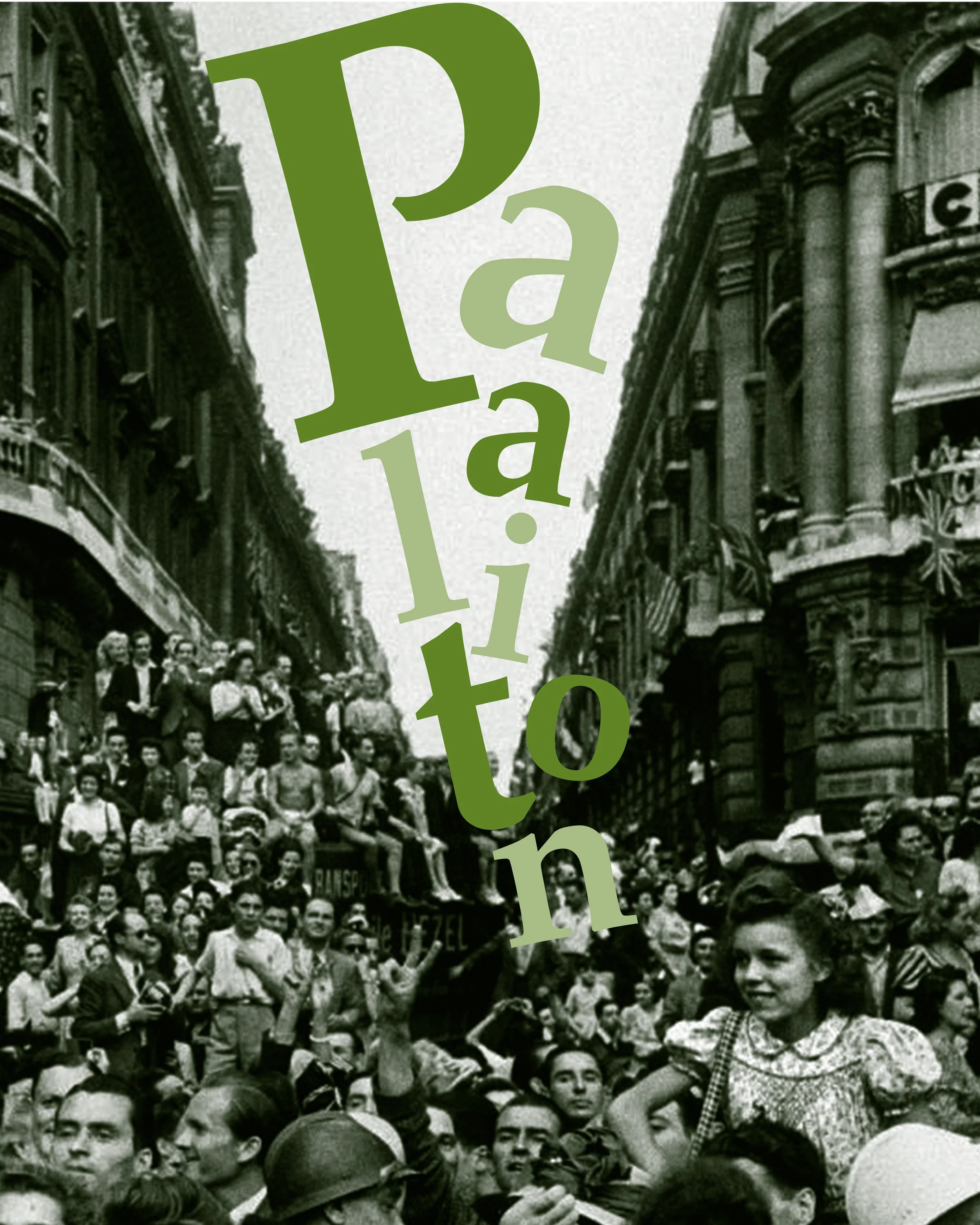
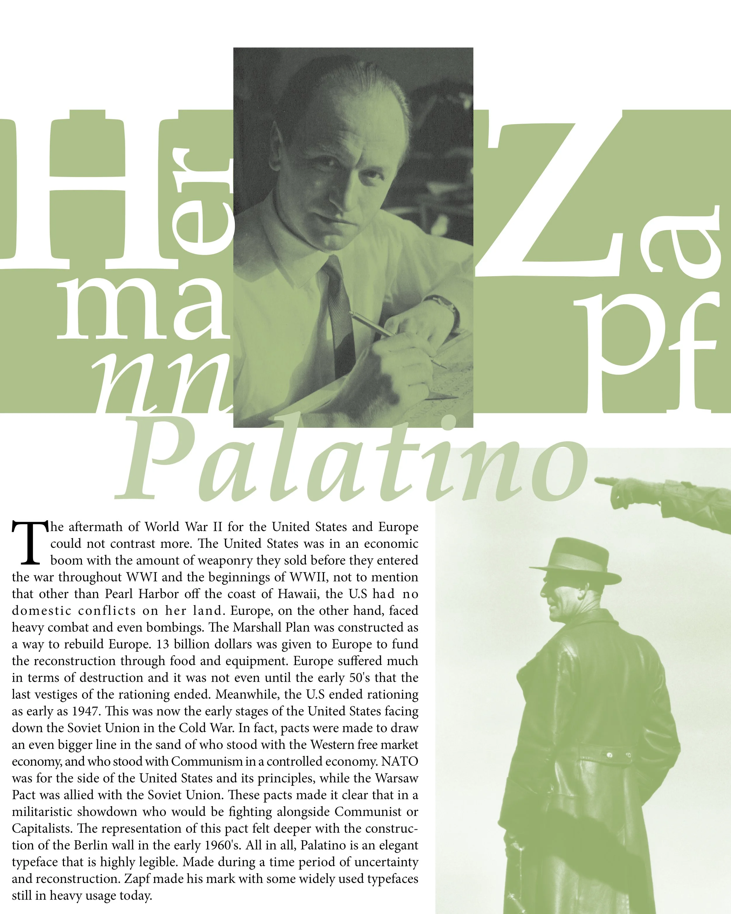
I approached the booklet as a historical narrative, pairing the typeface’s structural evolution with the emotional context of post-WWII Germany. The strategy focused on "Typographic Architecture"—using the letterforms themselves as structural elements within the layout. By integrating large-scale characters into historical photography, I created a sense of environmental depth, allowing the typography to interact with the imagery rather than just sitting on top of it.
Typographic Hierarchy: Leveraged Palatino’s varying weights and scales to create a clear information hierarchy, ensuring historical text, character specimens, and captions remained distinct despite the single-typeface constraint.
Compositional Integration: Engineered layouts where oversized glyphs and numerals interacted directly with photographic subjects, transforming standard character documentation into immersive visual storytelling.
Duotone Color Systems: Utilized a muted, two-tone palette to evoke a sense of period-accurate nostalgia while providing the necessary contrast for modern readability and high-impact spreads.
Structural Documentation: Systematically cataloged the full character set and numerals, utilizing whitespace and grid alignment to showcase the unique calligraphic strokes and "humanist" qualities of Zapf’s design.
Editorial Pacing: Orchestrated the flow of imagery and text to provide "visual breathing room," ensuring that the dense historical data remained accessible and engaging for the reader.
design
Results
The final publication serves as a sophisticated balance between creative expression and technical discipline. By successfully navigating the project’s limitations, I produced a compelling editorial piece that honors the history of Palatino through intentional design. The project demonstrates my ability to solve complex aesthetic challenges within tight brand or technical specifications, resulting in a cohesive and scholarly visual experience.The final publication serves as a sophisticated balance between creative expression and technical discipline. By successfully navigating the project’s limitations, I produced a compelling editorial piece that honors the history of Palatino through intentional design. The project demonstrates my ability to solve complex aesthetic challenges within tight brand or technical specifications, resulting in a cohesive and scholarly visual experience.