overview
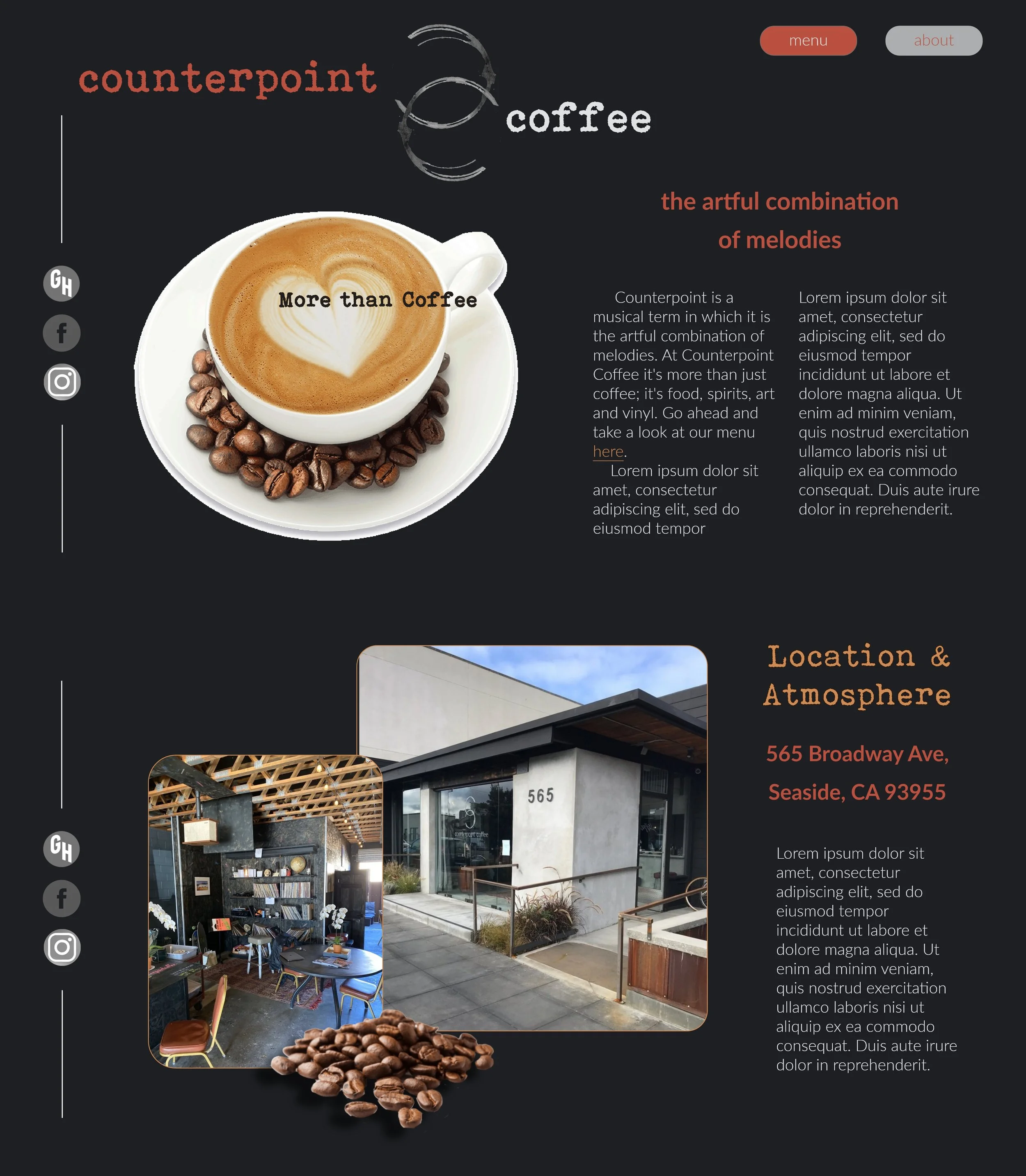
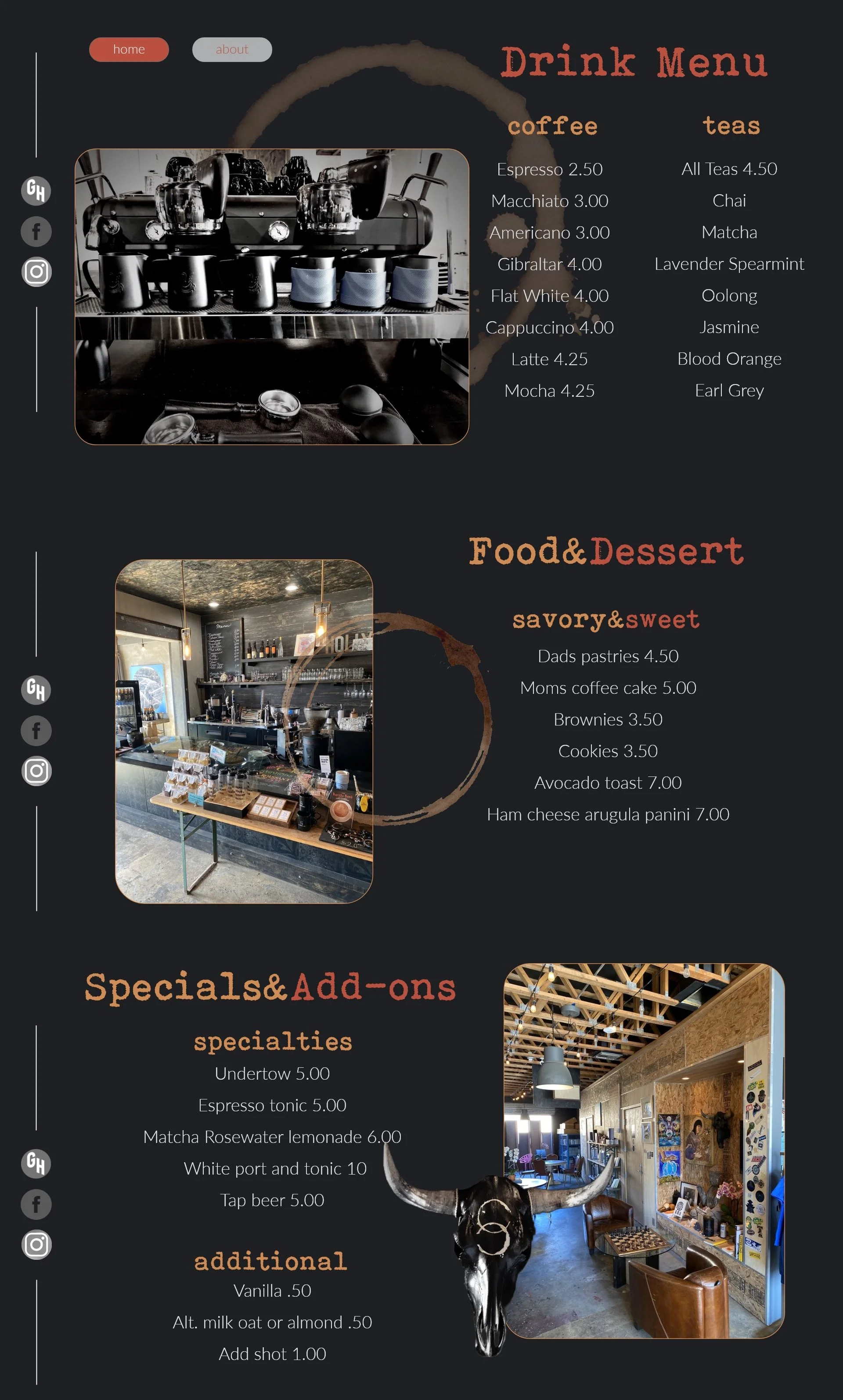
Counterpoint Coffee is a digital-first conceptual project focused on developing a high-impact web presence. The objective was to design a comprehensive homepage and supporting architecture that communicates brand personality while prioritizing user engagement and modern interface standards.
The project required the creation of a complete visual language from the ground up, in the absence of pre-existing brand guidelines. The primary challenge was to establish a cohesive aesthetic, ensuring the digital experience could compete with established specialty coffee retailers.
Challenge
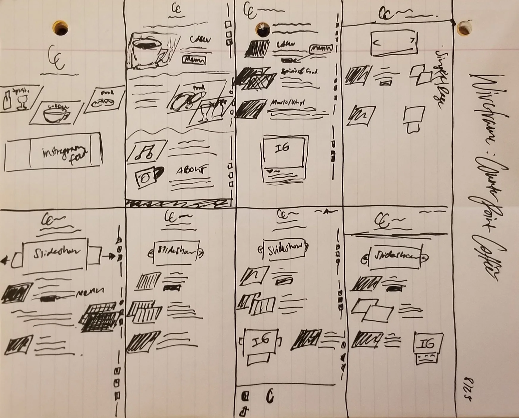
I developed a visual theme that balances warmth with minimalist modernism. By establishing a rigorous layout hierarchy, I organized key user touch points: navigation, hero storytelling, and product highlights, into a seamless flow. The approach focused on using whitespace and deliberate typography to create a sense of clarity and brand "voice" without overwhelming the user.
Approach
Interface Architecture: Designed a high-conversion hero section that pairs bold brand introduction with clear calls-to-action (CTAs).
Visual Identity Development: Curated a custom typography and color system specifically for the digital environment, ensuring legibility across varying screen scales.
Component Design: Built modular sections for product highlights and service features, demonstrating a scalable design system that can grow with the brand.
Content Hierarchy: Balanced high-quality photography with strategic text placement to create an immersive visual story that guides the user toward conversion.
UX/UI Mockups: Developed high-fidelity screens illustrating a polished, "market-ready" digital experience that emphasizes ease of navigation.
Design
result
The project resulted in a robust digital blueprint that successfully bridges the gap between coffee culture and modern web design. The final mockups serve as a proof-of-concept for a scalable, identity-driven website that enhances online brand presence and streamlines the customer journey.