overview
One district within the American Motorcyclist Association (AMA), which oversees professional and amateur motocross in the United States, required a fast-turnaround design for an end-of-season banquet where racers, their families and sponsors all get together to celebrate the end of the racing season. As such, they needed to feel ceremonial and distinct from the awards given out all season long. I led the design direction for a design system that used standard award components but required a unique, scalable approach across 300 competitors with varying classes, placements, sizes, and names. The full timeline from concept to delivery was approximately two weeks, which required a clear, focused design system strategy from the start
**Details and visuals have been modified to respect confidentiality agreements**
challenge
Approach
The primary challenge was to create a design that felt unique and elevated while remaining scalable across hundreds of individualized awards, all within a tight timeline. The solution needed to stand apart from previous seasons while maintaining clarity, consistency, and visual impact.
I reframed the awards as ceremonial rather than a typical motocross graphic. Instead of repeating the maximal, aggressive visual language used throughout the season, I focused on restraint, clarity, and consistency. The goal was to create a design that felt elevated and formal, while still signaling motocross through more subtle typographic choices.
Design
My first step was to review previous award designs for this district to understand established designs that worked in the past with the opportunity to change and evolve the design. Previously, these awards leaned heavily into typical maximalist motocross motifs: metal textures, heavy gradients, and dirt track imagery. However, the banquet setting is more formal and represents the culmination of an entire season, I intentionally scaled back from typical motocross visuals. I developed a minimalist, clean approach that allowed riders, sponsors, and placements to be presented clearly without visual clutter.
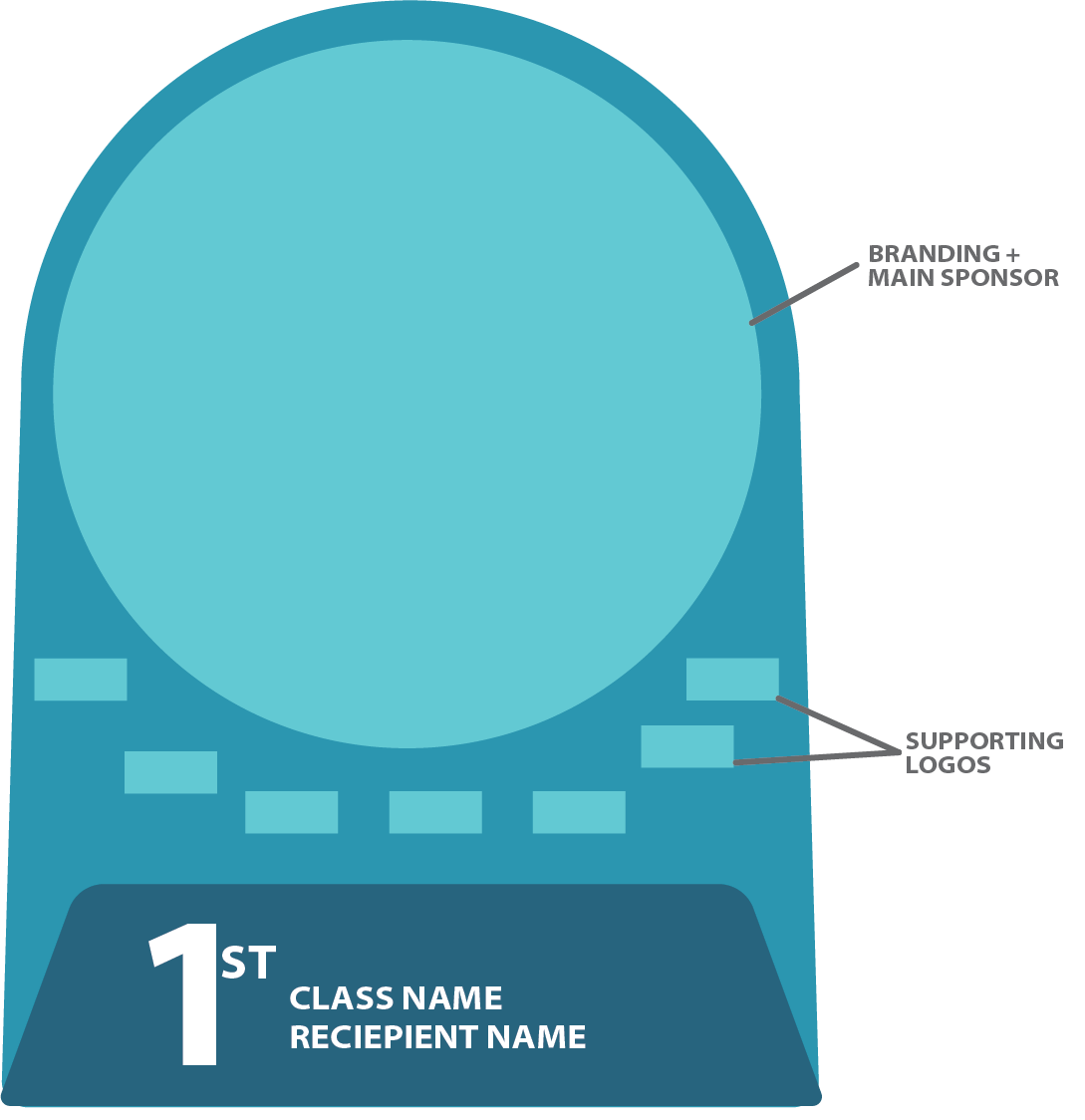
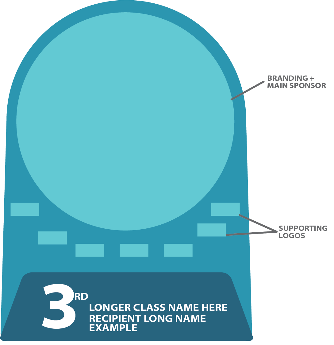
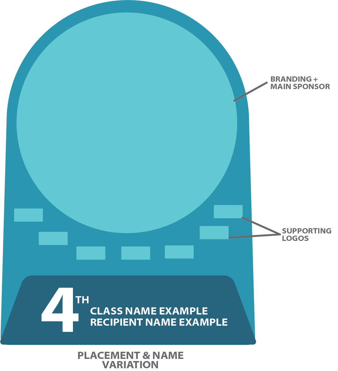
A key decision was the use of clear as the primary visual foundation. Clear is uncommon in motocross awards, and this choice allowed the district to stand out while reinforcing the ceremonial nature of the event. To support the minimalist direction, the color palette was limited to black, white, and clear. This restraint allowed sponsor logo, each with their own brand colors, to be the primary source of color and visual emphasis, aligning with the banquet’s role in highlighting sponsor contributions. However, my goal was not to stray too far from motocross elements and their typical branding for awards. I kept in large sans-serif typography and subtle grunge textures were retained for rider names, class names, placements, and sponsor listings. This balance preserved the sport’s character without relying on overt or dated visual tropes while ensuring legibility to boot.
Result
The final awards were ultimately successful, and applied across 300 individualized awards. Each maintained visual consistency and clarity throughout. The standardized approach streamlined the design process under a tight deadline and became a reliable template for future use.